


Microsoft Begins Rolling Out New Xbox Home UI - News
by William D'Angelo , posted on 01 August 2023 / 3,844 ViewsMicrosoft announced it has begun rolling out a new Xbox Home user interface on all Xbox Series X|S and Xbox One consoles.
The new user interface has been designed from player feedback and will be rolling out over the course of the next few weeks.
"Improving the Home Experience has been truly a Team Xbox effort —from engineers to designers to researchers and many more," reads the Xbox Wire post on the new Xbox Home UI. "We started by investing in infrastructure that would allow us to try different layouts of the page with different content for different situations and customers. We then evaluated many different elements of the design process including what people interact with in the experience, how easy it is for people to complete the action they want to take, and how satisfied they are with the overall experience. Once we had a version that was ready to share, we started to roll it out to our Xbox Insiders.
"When we first showed Xbox Insiders what we were working on we heard your feedback clearly – you wanted more room to show off custom backgrounds or game art, quicker navigation options, and more personalization. Over the last 8 months since initial release, we’ve implemented changes to meet those requests and have a new Home that feels fresh, puts the focus on your games and apps, and creates space for beautiful backgrounds."
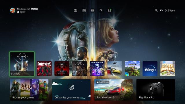
Here is the list of changes to the Xbox Home UI:
- Makes it easy to go to your Library, the Microsoft Store, Xbox Game Pass, Search, and Settings at the very top of your Home by introducing a quick access menu.
- Creates more space for your personalized background by simplifying the layout and putting the games you recently played and other content and apps towards the bottom of the screen.
- Adds an option to change your background to match the game you are highlighting in the recently played list.
- Improves game discovery by introducing lists of games curated and personalized for you.
- Allows you to customize your experience by pinning your favorite games, curated groups, and system groups like Quick Resume to Home.
- Helps you find what’s going on in your community through the updated Friends & Community Updates row.
- Shows you what media apps and content are available to you via a Watch & Listen spotlight and list of entertainment apps.
A life-long and avid gamer, William D'Angelo was first introduced to VGChartz in 2007. After years of supporting the site, he was brought on in 2010 as a junior analyst, working his way up to lead analyst in 2012 and taking over the hardware estimates in 2017. He has expanded his involvement in the gaming community by producing content on his own YouTube channel and Twitch channel. You can contact the author on Twitter @TrunksWD.
More Articles

Overall, I think it's the better than the previous dashboard. Hopefully the full release allows more than 2 groups of pins like before.
Why now we can only put two folders on the dashboard? : (

I like it. The changes are obvious yet also not to where you have to relearn anything. It looks fine, too.
Looks like Playstation in green.

Are they fixing the Wish list? What a slog to find a game on sale.
Will tell you 4 games on sale, and many games require you to click on them to see the sale price, its such a stupid system. Also the single line layout is pathetically bad.
Why don't they just make one good UI and leave it be? I hated back on the Xbox one when they completely changed for the worst. And you still have to deal with all the adds in the home page. Their goal is not to make a good UI but to make a UI which can sell you more stuff. As of now, the switch has the best UI by far, and then the ps5 is not too bad but could be better.
Xbox did this with the previous UI and people complained about it not being different for the new generation launch. The UI has been roughly the same since 2018 and gotten better over time with updates, especially with the Series X|S because of the speed and revamped store.
This new UI is still very similar to the previous with mostly positive changes. Biggest issue now is not allow more than 2 groups on the home page. I imagine they will change this eventually after all the complaints.

Looks great far superior to the other home menus


