


Insomniac Games Reveals New Logo - News
by William D'Angelo , posted on 20 September 2017 / 6,791 ViewsInsomniac Games has revealed a new logo. It has been over 15 years since the developer changed its logo.
![]()
Read what Insomniac said on the new look below:
We’ve always tried to evolve with the constantly changing industry we adore. That’s one of the challenges and blessings of remaining completely independent as a studio. But our logo has largely remained the same while we continue to grow. Considering our 25th anniversary in a couple years, and the 15th anniversary of Ratchet & Clank this year, it has become even clearer to us that it’s time to more closely match our visual identity with our studio vision.
As we contemplated a re-brand of our visual identity, we challenged ourselves to “think beyond the moon.” That meant eschewing a simple logo refresh. Instead, we wanted a redesign that reflected our evolution as a studio and as people while retaining some familiarity to our past logo treatments.
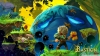
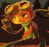
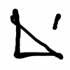
We reviewed this design very early in the exploration process. It caught our attention immediately, and wouldn’t let go even after we explored other directions. It works on multiple levels for us. It’s got a lunar theme, with what appear to be two crescent moons facing each other as the “O” – reminiscent of our past and future. Many folks here also see a portal or lens for the “O”, which we like because it symbolizes exploration as well as how many of our fans see us differently. Some follow us simply because we created their beloved Spyro the Dragon. For others, it’s all about Ratchet & Clank, or Resistance, Sunset Overdrive, our virtual reality games or Song of the Deep. And now we have entirely new fans swinging into our neighborhood to check out the latest on Marvel’s Spider-Man.
Observant fans will see the subtle callbacks to our previous Insomniac Games logo, including the oversized “O,” serif lettering on the “N” and the positioning of “Games” as a core part of our identity.
A life-long and avid gamer, William D'Angelo was first introduced to VGChartz in 2007. After years of supporting the site, he was brought on in 2010 as a junior analyst, working his way up to lead analyst in 2012. He has expanded his involvement in the gaming community by producing content on his own YouTube channel and Twitch channel dedicated to gaming Let's Plays and tutorials. You can contact the author at wdangelo@vgchartz.com or on Twitter @TrunksWD.
More Articles

A way better logo than before. More modern and stylized font, less cartoony. It feels overall more serious and the moon is better integrated. Slightly less agressive colors, more in the trendy colour tones (Sea Star, Blue Gray, Dark Grey). Congratulations, Insomniac.
All those new logos are boring AF. The previous logo perhaps looked less professional but was way more unique and playful. In that regard it reflected most of their games better than this generic logo.

ehhh i liked the old one

Somebody is a fan of A Perfect Circle
A suit and tie logo..... Gamers are anything but suit and tie....
15th anniversary of Ratchet and Clank AND a new logo, but no new game announced? :/

Best Dev games

Boring, corporate sterile even. Lacks any of the personality and originality of the original logo
Stylish but also quite boring. The new logo resembles a ton of other logos much more than the old one. It's not a bad change, but I think I preferred the old logo because it had more personality.


 Essay Pro