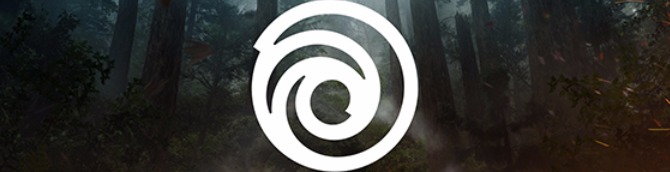
Ubisoft Updates Logo - News
by William D'Angelo , posted on 01 June 2017 / 9,253 Views
Ubisoft has updated its logo for the first time since 2003 with a new swirl and font.

Here is the history of logos:
It all started in 1986 with this rad design – a look inspired by the distinct visual style of the ’80s. At the time, Ubisoft was a local distributor of video games.
Nine years later, Rayman was born and Ubisoft introduced the rainbow. This marked the company’s shift from distributor to creator, and highlighted the fact that Ubisoft was creating mainly family-oriented content.
In 2003, the swirl appeared on the scene and once again signaled a shift. It followed the acquisition of Red Storm and the creation of new Tom Clancy titles, marking a more mature and diversified approach.
Today, we create worlds – worlds that live as video games, comics, movies, TV shows, books, and amusement park rides. Our new logo is minimalist, modern and monochromatic. It’s a window into our worlds, giving a preview of what’s to come by highlighting the artistry that goes into creating them. The swirl and the letter O are both deliberately created to be reminiscent of hand-drawn shapes and represent our human qualities of enthusiasm, curiosity and the grain de folie that Ubisoft is known for.
With this new look, we proudly embrace our role as a creator of worlds and invite you, the players, to continue playing, engaging, and growing with us. As we move towards our most exciting time of the year (E3!), you will see this new emblem take on the colors and textures of our worlds, and we can’t wait to hear what you all think.
A life-long and avid gamer, William D'Angelo was first introduced to VGChartz in 2007. After years of supporting the site, he was brought on in 2010 as a junior analyst, working his way up to lead analyst in 2012. He has expanded his involvement in the gaming community by producing content on his own YouTube channel and Twitch channel dedicated to gaming Let's Plays and tutorials. You can contact the author at wdangelo@vgchartz.com or on Twitter @TrunksWD.
More Articles

Even downgrading their logo these days...
The logo might be bad buys, but lets wait for the day one patch, that'll fix it.

Looks bad man.
SlowNewsDay Also, it looks like a step into the cheap direction.

Font is nice, but the logo itself seems unpolished.

Looks bad man.

looks like hot garbage.
Looks horrible in a small picture. Looks decent in a bigger picture. It has a nice idea but definitely needs some polish.
Kinda similar to the last one but expected, no company can afford a noticeable logo change nowdays... Still hoping for a Blood Dragon 2 using the original logo <.<
Not a fan
This is a horrible logo. The swirl doesn't work in monochrome.